QUEEN
Brand IdentityQUEEN is a cosmetic brand concept centered on empowering women through bold visual expression. The brand challenges traditional beauty narratives by presenting femininity as strong, confident, and unapologetic.
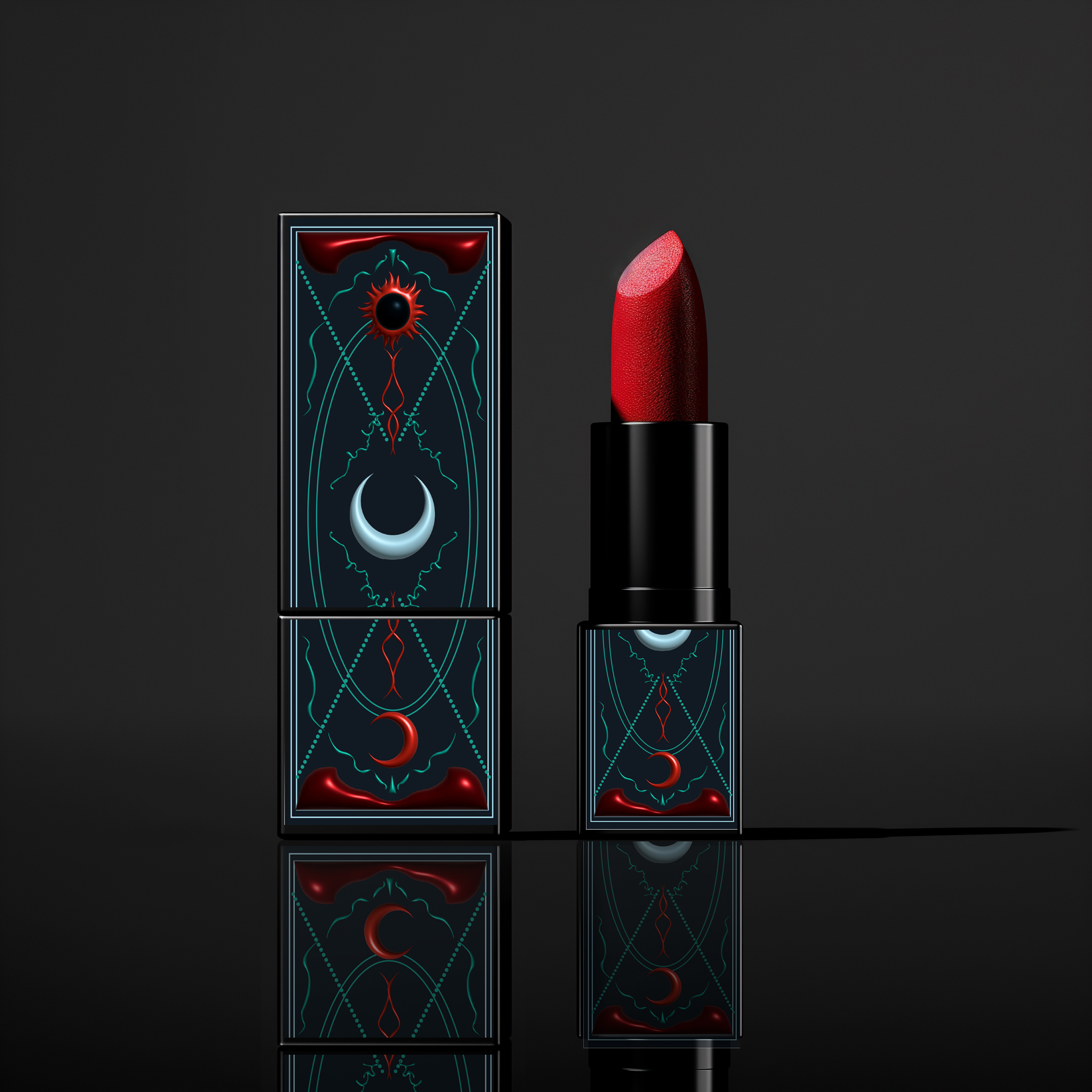
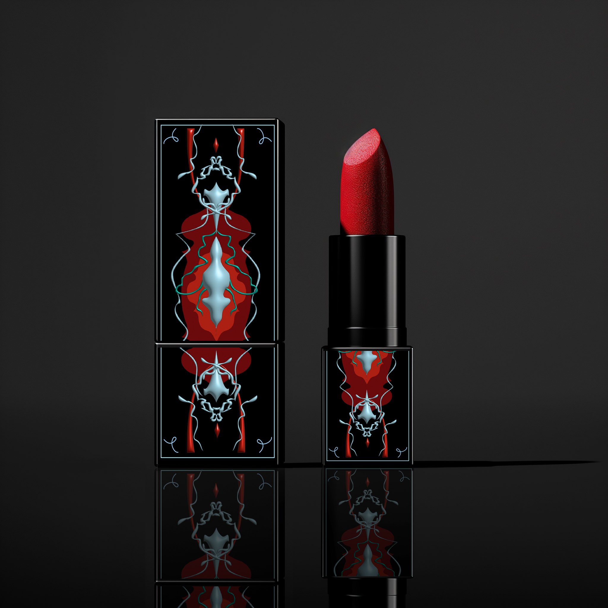
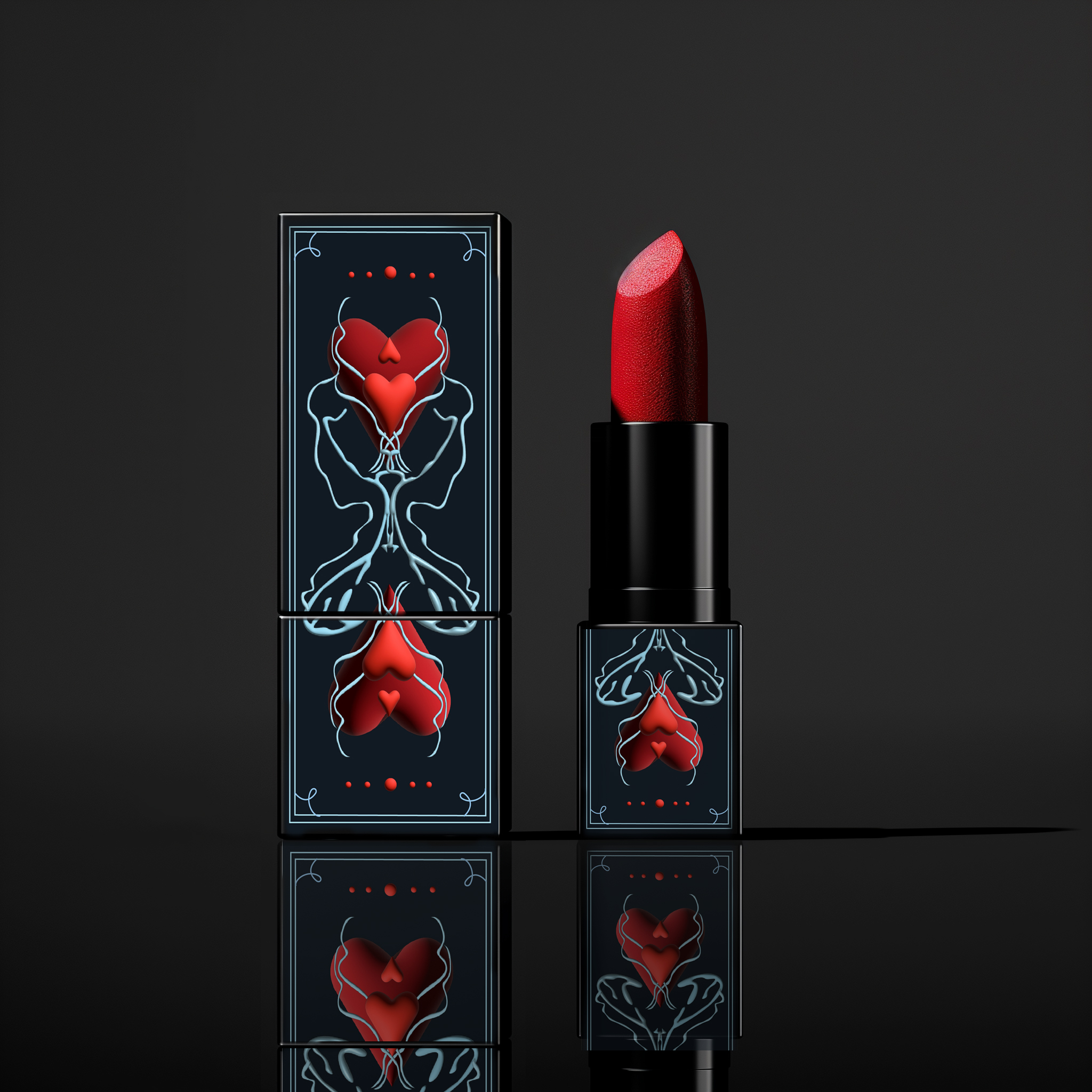
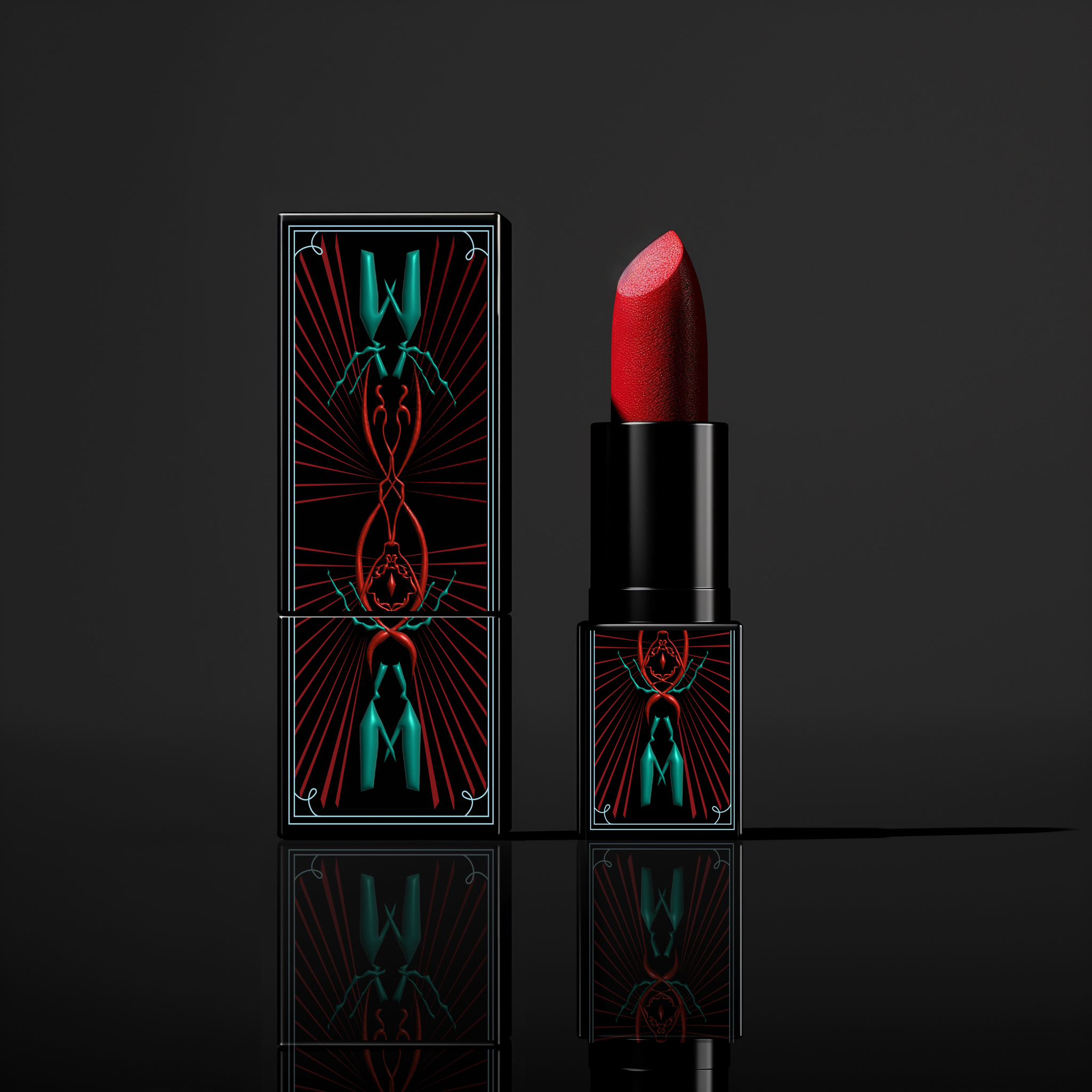
A striking red palette anchors the visual identity, chosen to convey power and intensity. The branding system was extended across product packaging, including lipsticks, foundations, and boxes, ensuring consistency and impact across all touchpoints.
By adopting a maximalist design language, the brand differentiates itself from dominant minimalist aesthetics while enhancing memorability and shelf visibility.


A cosmetic brand concept centered on confidence, strength, and self-expression.
QUEEN is a cosmetic brand concept built around the belief that confidence and strength define modern femininity. The brand reframes women not as delicate or ornamental figures, but as powerful individuals—queens who possess inner authority and self-respect.
Inspired by the symbolism of a crown, the visual and conceptual language represents
empowerment, dignity, and presence.
Rather than serving as a decorative motif, the crown functions as a metaphor for personal strength and self-worth.
QUEEN aims to create beauty products that support self-expression and confidence across diverse backgrounds. Through bold visual storytelling and a strong brand voice, the brand encourages individuals to embrace their identity, recognize their value, and carry themselves with confidence—much like the meaning embodied by a crown.

QUEEN was developed as a cosmetic brand concept that emphasizes confidence as a core value rather than an aspirational ideal. The brand is designed to resonate with individuals who view beauty as a form of self-assertion and personal expression, rather than conformity.
The visual system prioritizes bold forms, high-contrast color usage, and sculptural compositions to convey presence and authority. Design decisions across packaging, imagery, and layout were intentionally structured to create strong shelf impact while maintaining a cohesive brand language.
Rather than following dominant minimalist beauty trends, QUEEN adopts a maximalist approach to establish distinction and memorability. This design direction reinforces the brand’s positioning as confident, unapologetic, and visually commanding within the cosmetic landscape.
The visual system prioritizes bold forms, high-contrast color usage, and sculptural compositions to convey presence and authority. Design decisions across packaging, imagery, and layout were intentionally structured to create strong shelf impact while maintaining a cohesive brand language.
Rather than following dominant minimalist beauty trends, QUEEN adopts a maximalist approach to establish distinction and memorability. This design direction reinforces the brand’s positioning as confident, unapologetic, and visually commanding within the cosmetic landscape.