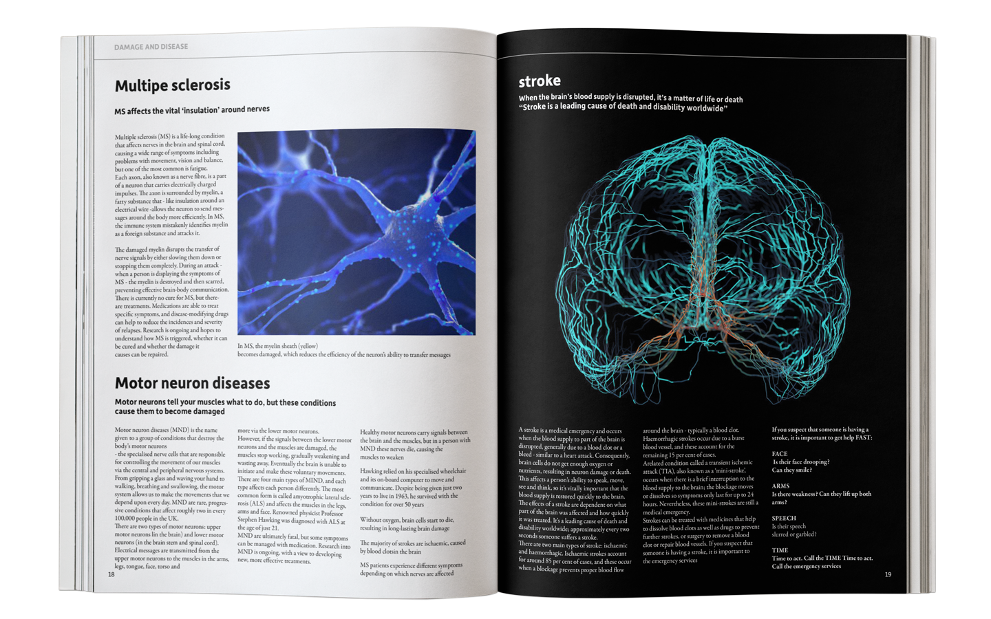
INSIDE YOUR BRAIN
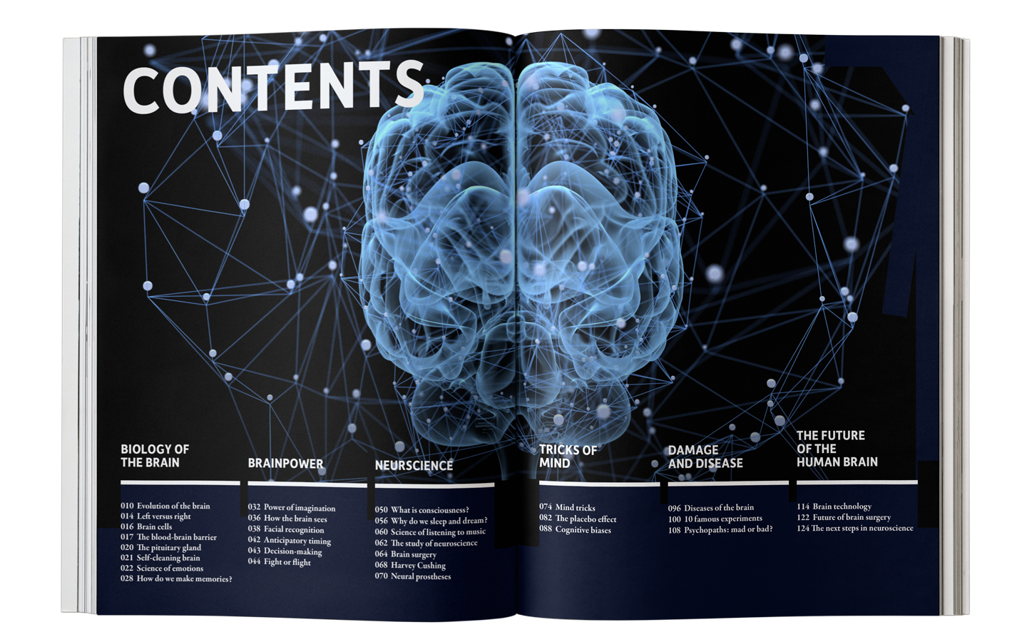
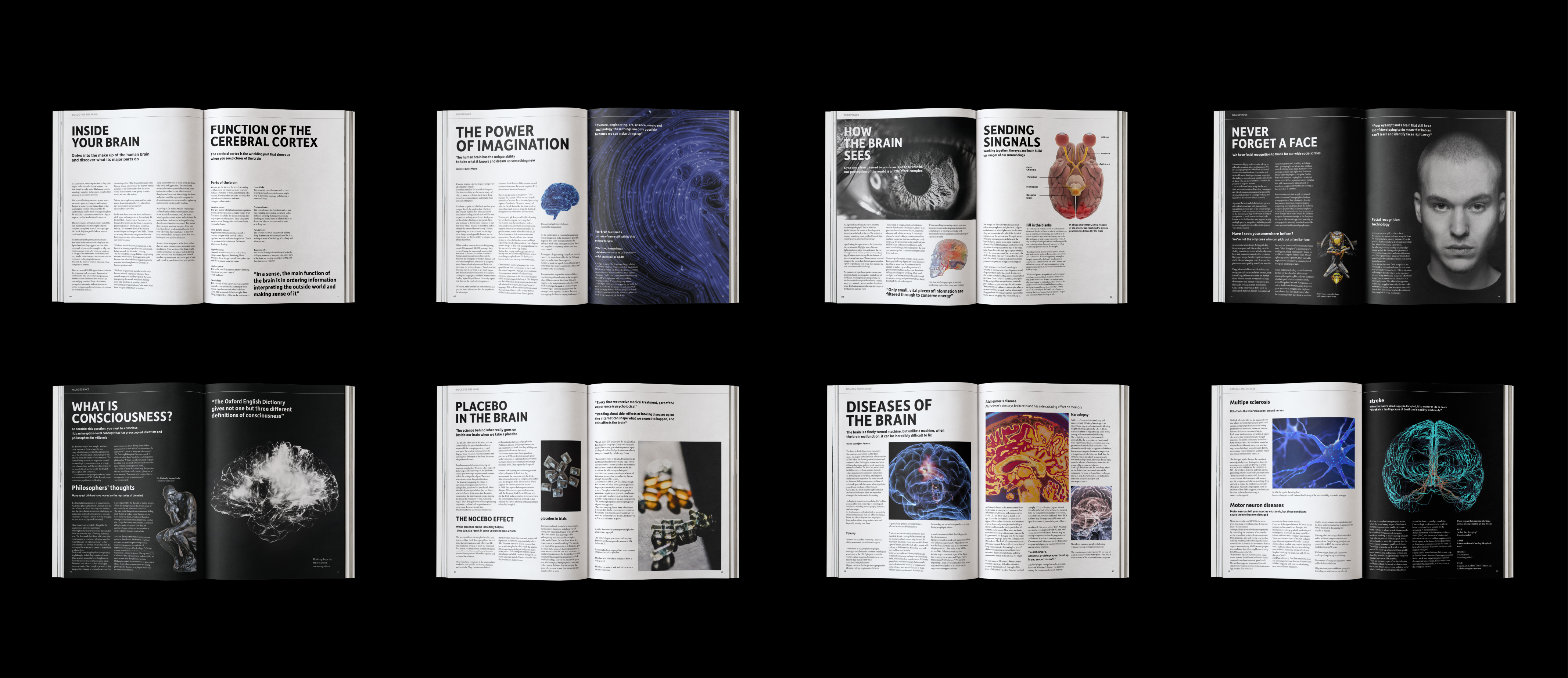
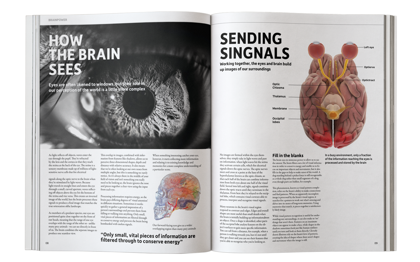
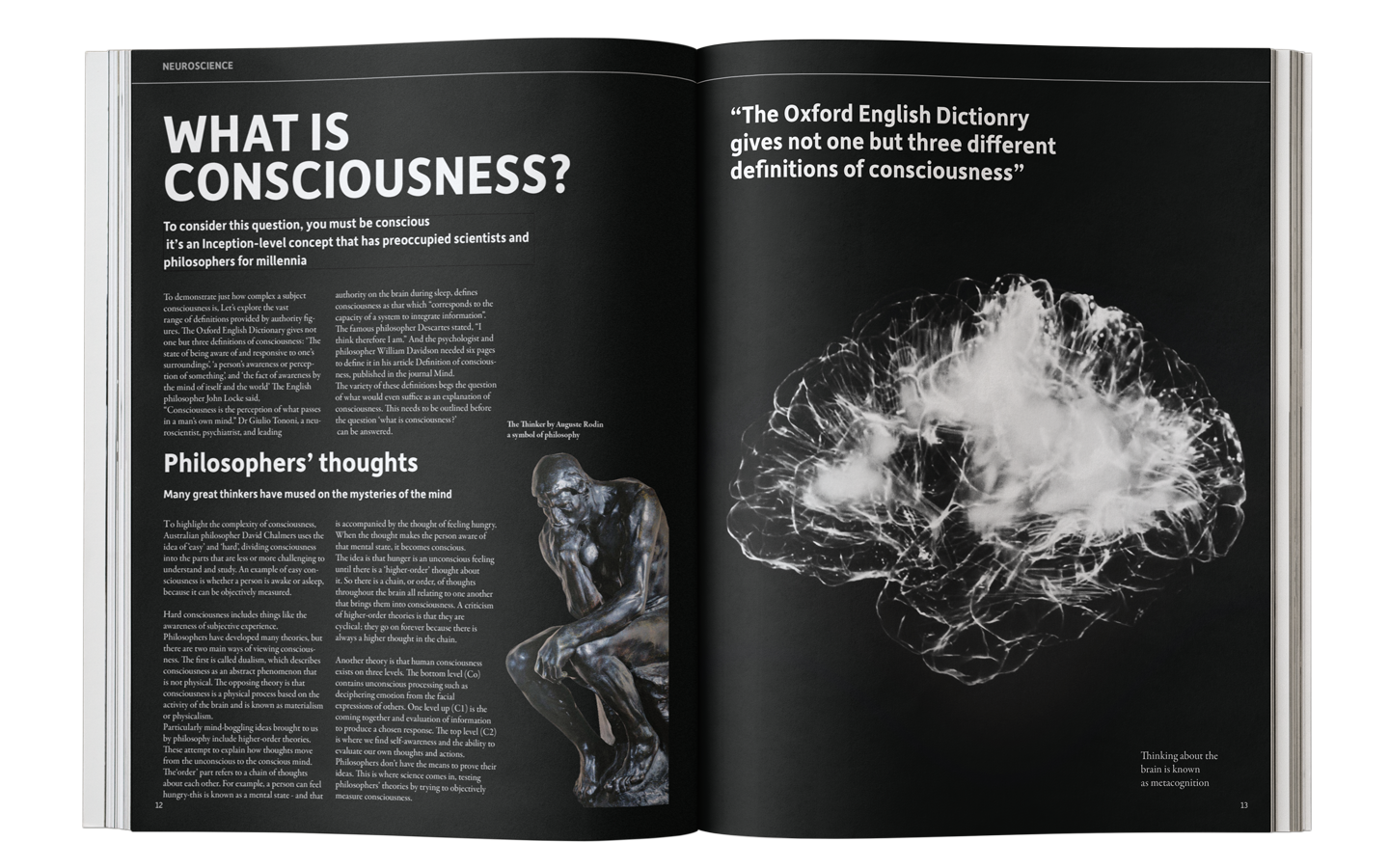
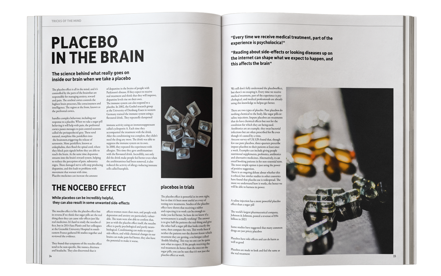
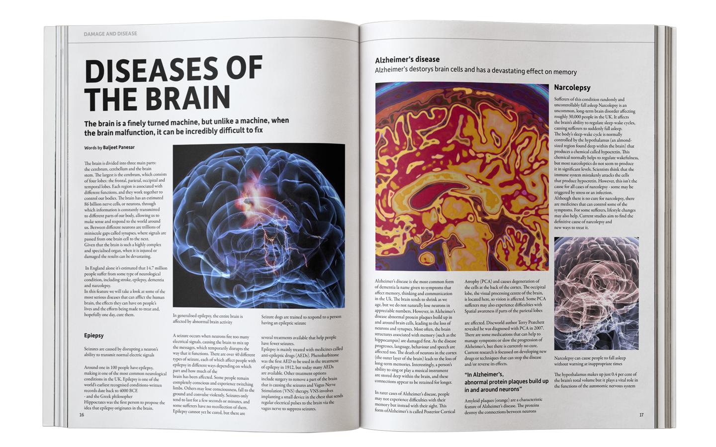
EditorialI reimagined the original magazine with a more refined and sophisticated design approach, targeting an adult audience. I developed four distinct cover designs and carefully replaced the original content with visually cohesive images that maintained the same context and message.
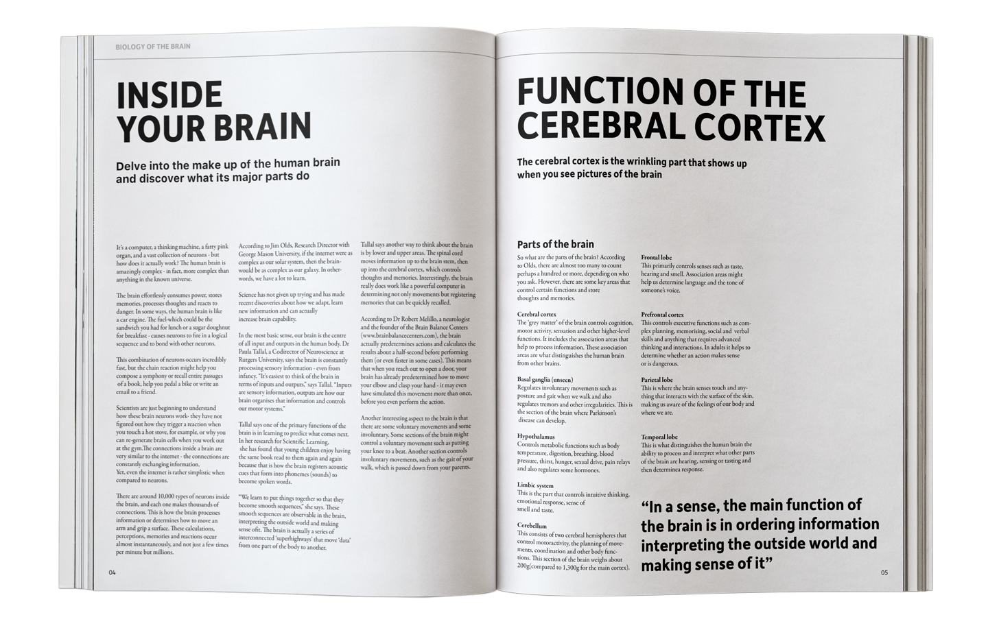
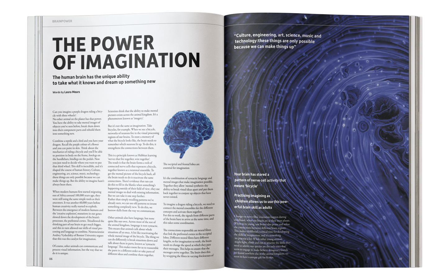
As a science magazine, I chose sans-serif typography to reinforce a clean, modern, and professional aesthetic. This project allowed me to experiment with various layouts and structural compositions, improving both visual hierarchy and overall readability.
As a science magazine, I chose sans-serif typography to reinforce a clean, modern, and professional aesthetic. This project allowed me to experiment with various layouts and structural compositions, improving both visual hierarchy and overall readability.
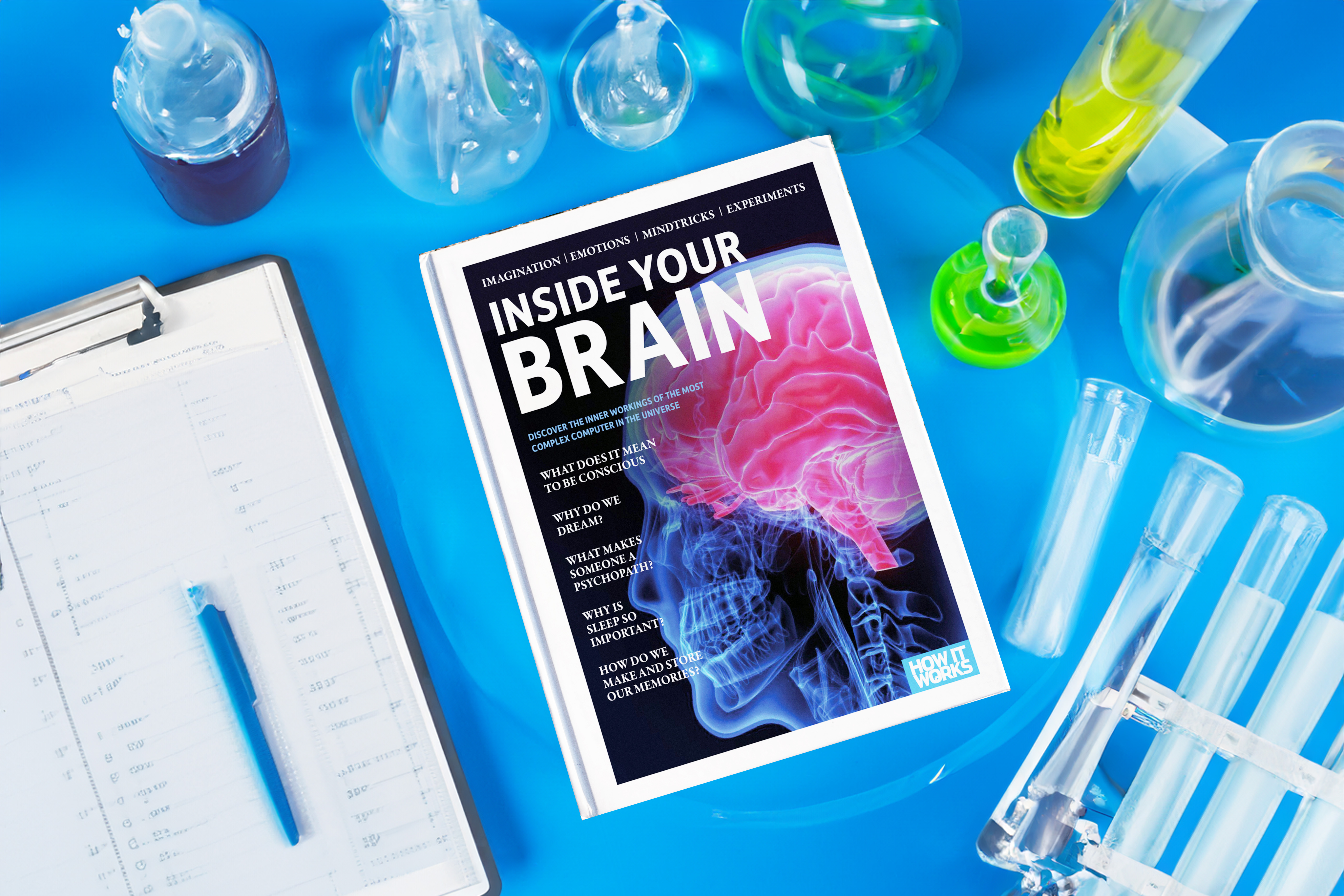

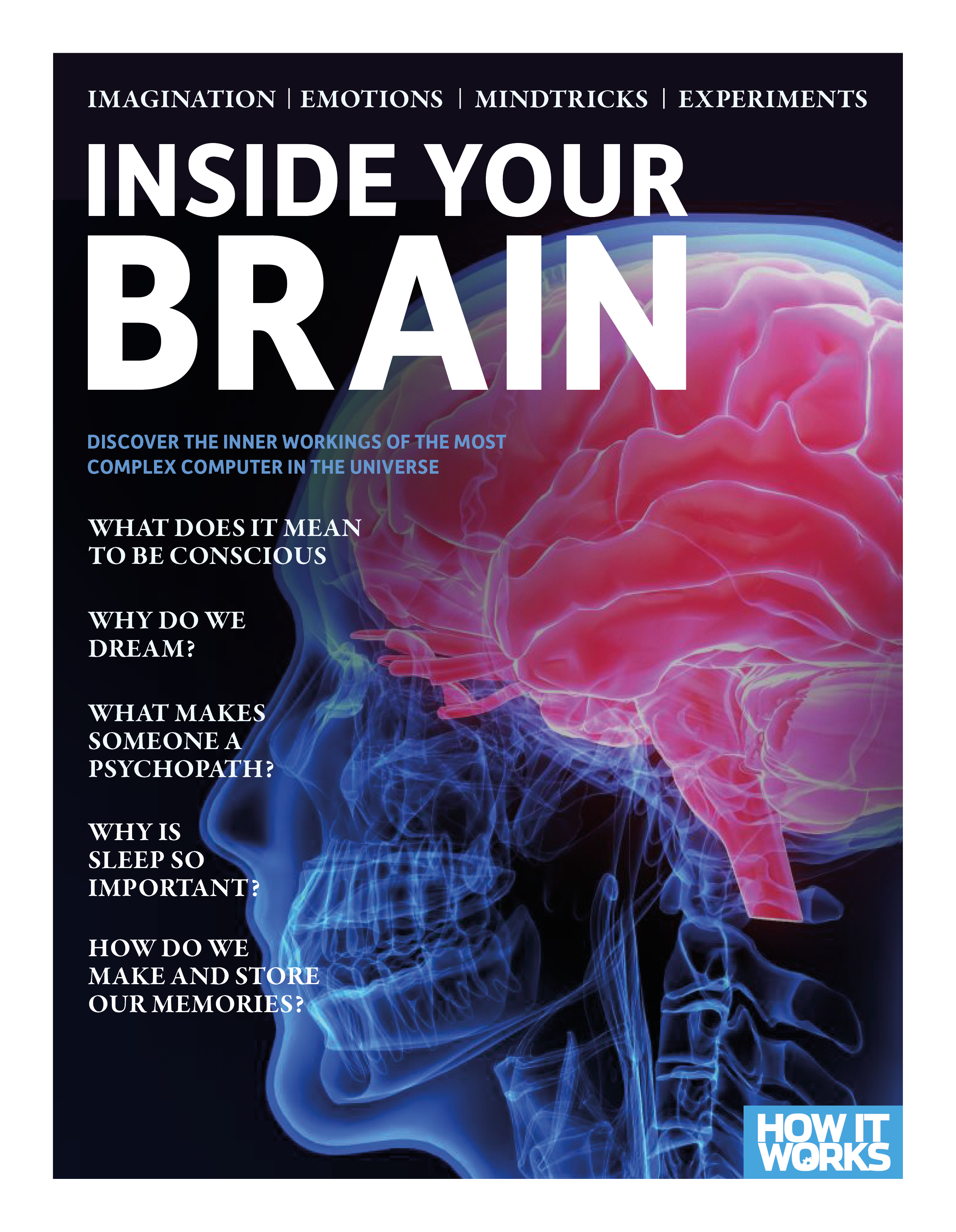
Origal Magazine’s Design
I changed the design as more clean and organized layout. Also change the picture more high quality however, I wanted to give a similar vibe so I used the San-serif font because I didn’t want to changed whole system and let people to recongize this brand.
What big things that I changed
1.Photo in the magzine.
2. Different columns
3.None consistent systems
4. A lot of fonts
I changed the design as more clean and organized layout. Also change the picture more high quality however, I wanted to give a similar vibe so I used the San-serif font because I didn’t want to changed whole system and let people to recongize this brand.
What big things that I changed
1.Photo in the magzine.
2. Different columns
3.None consistent systems
4. A lot of fonts