CHANGERS
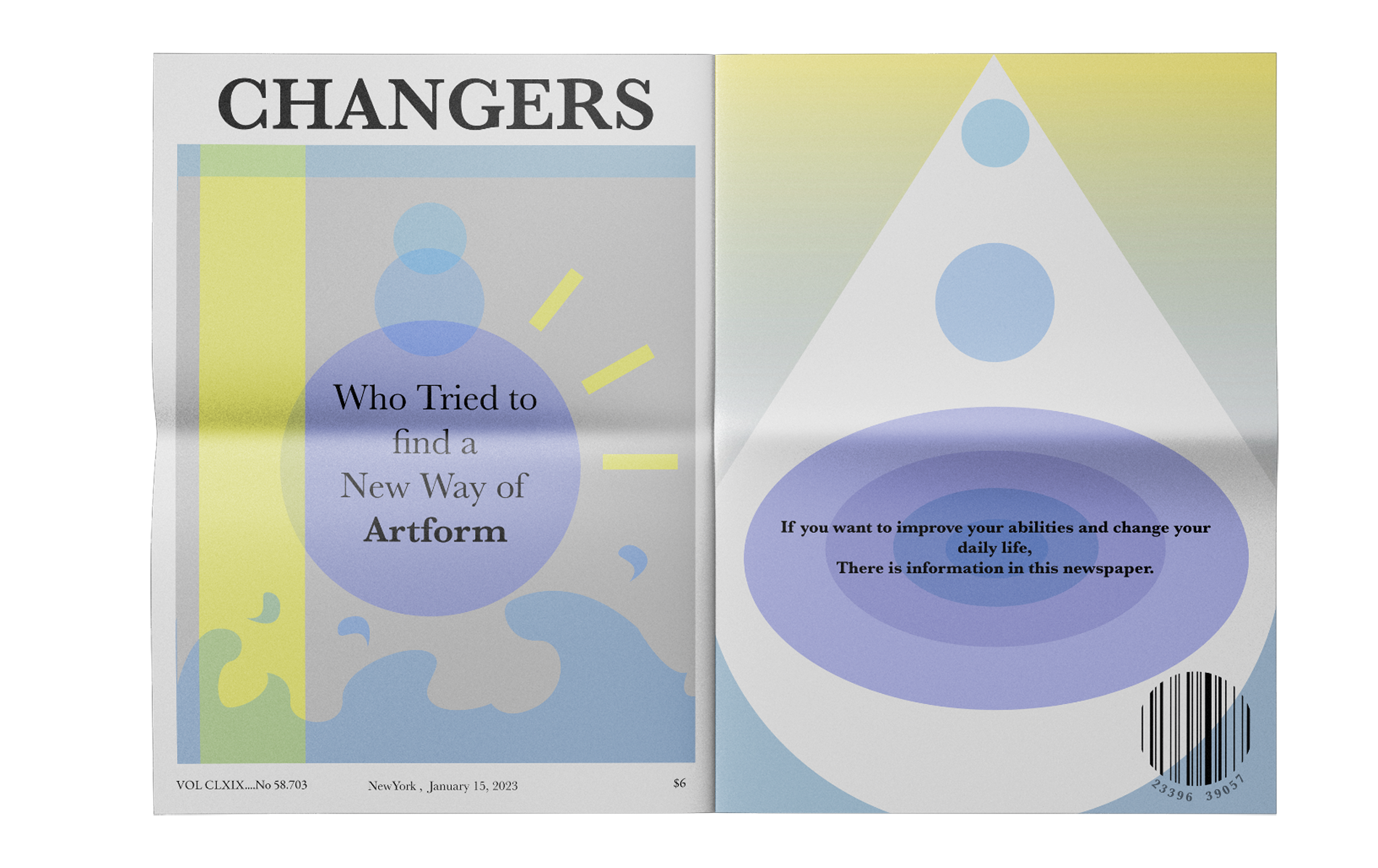
EditorialThis editorial project explores the visual language of Impressionism through the format of a newspaper.
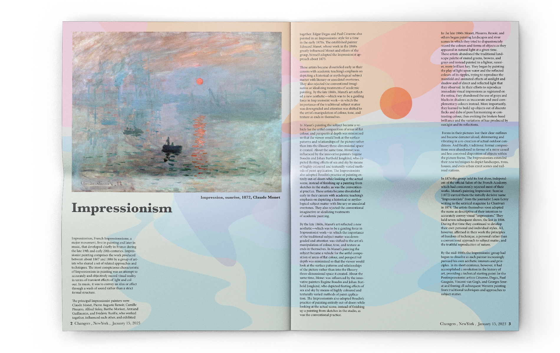
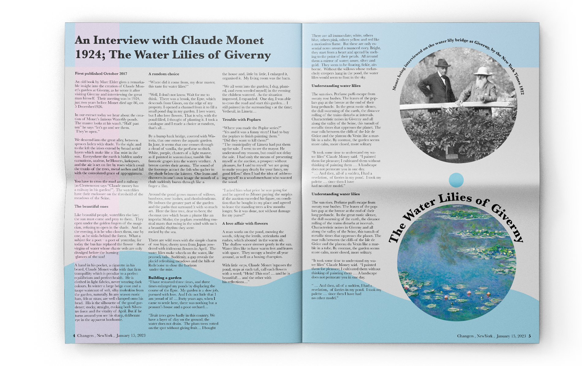
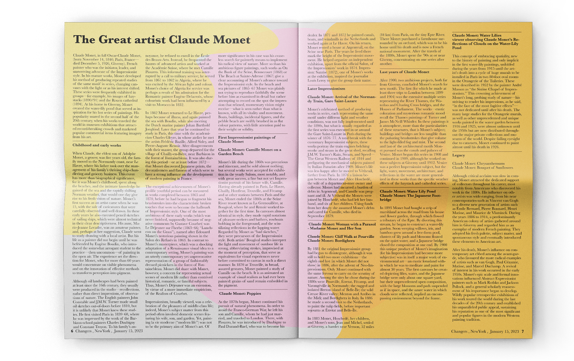
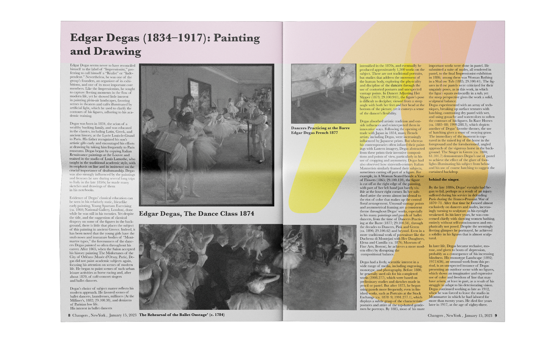
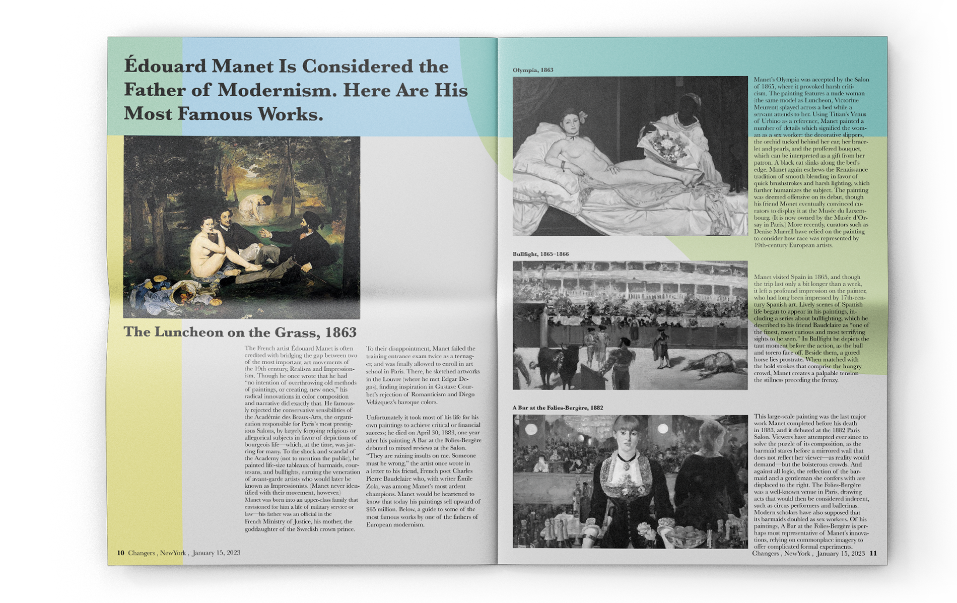
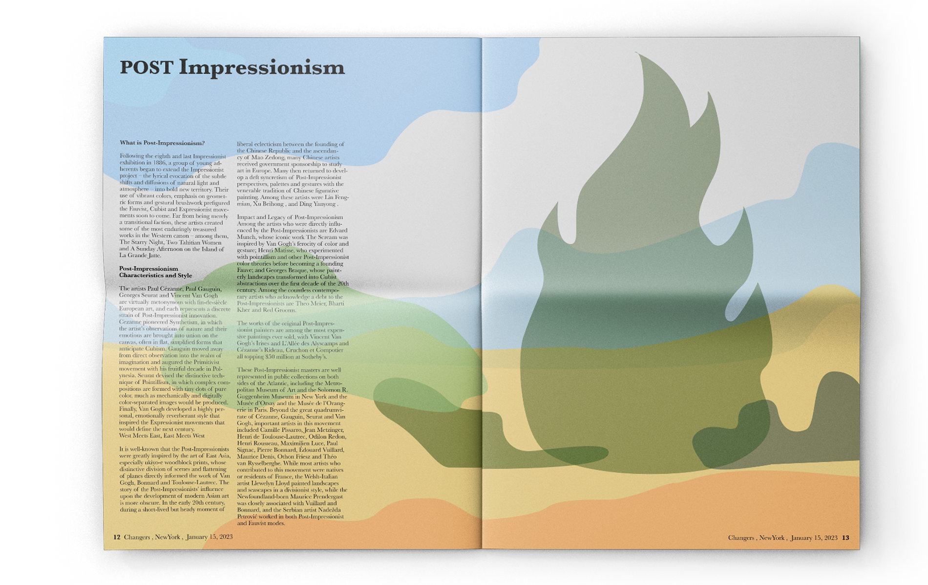
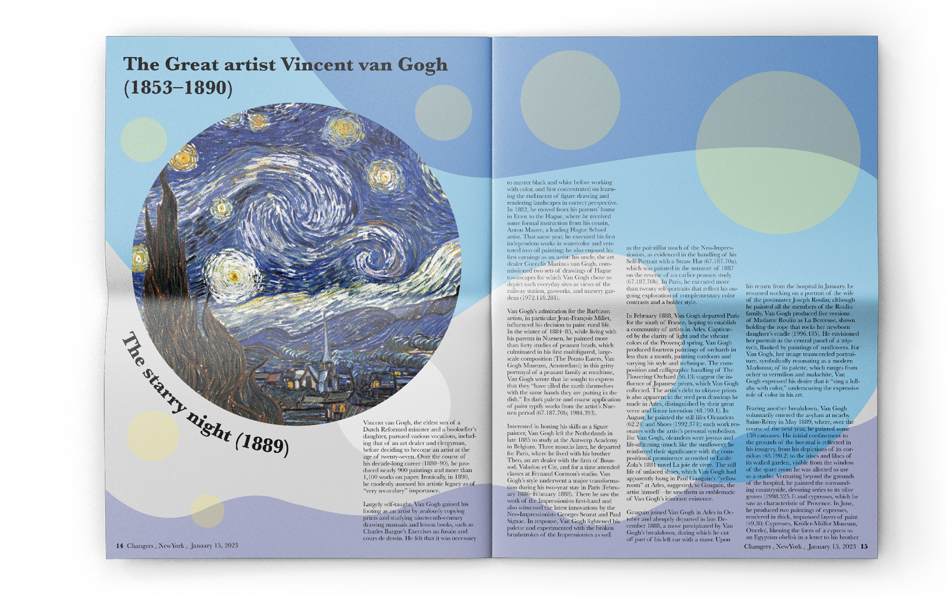
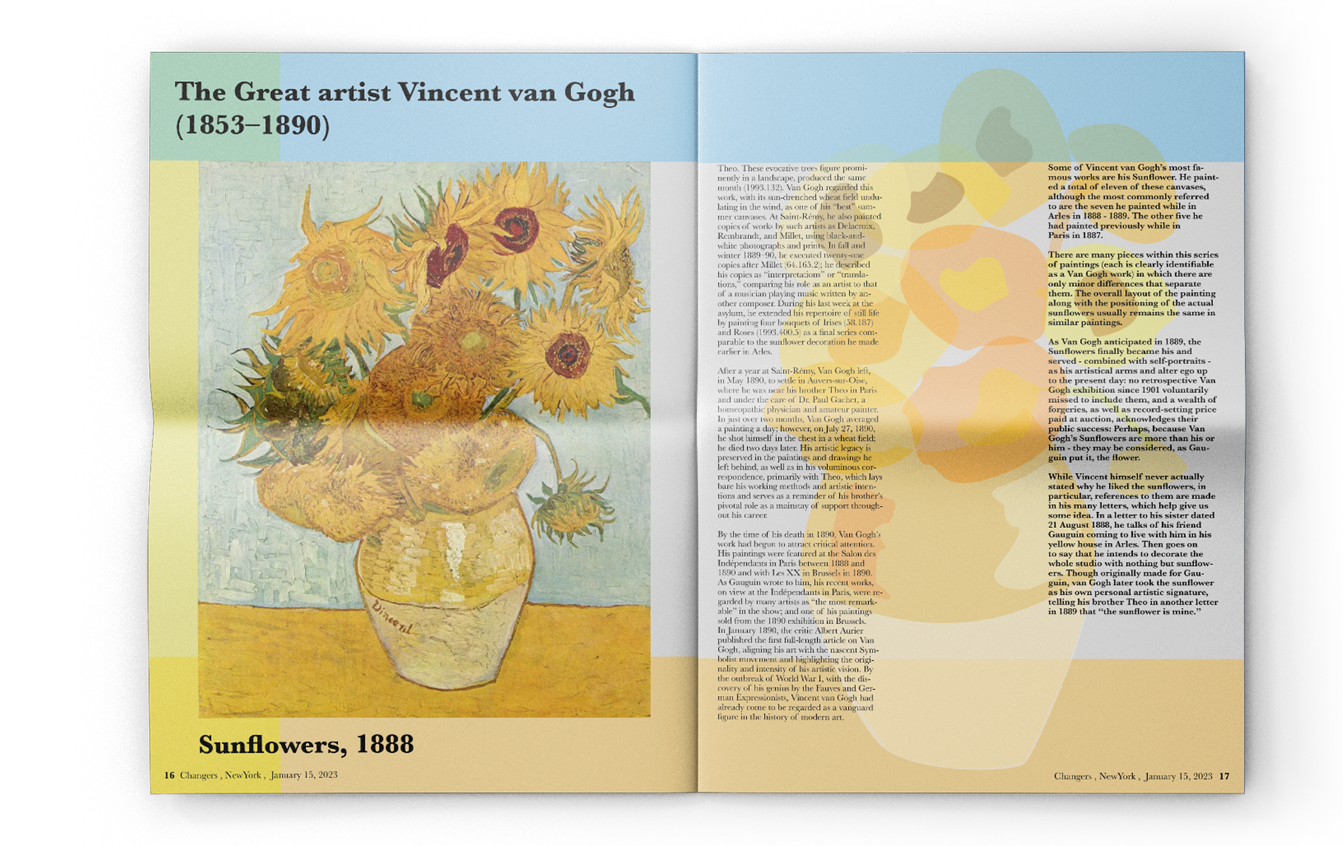
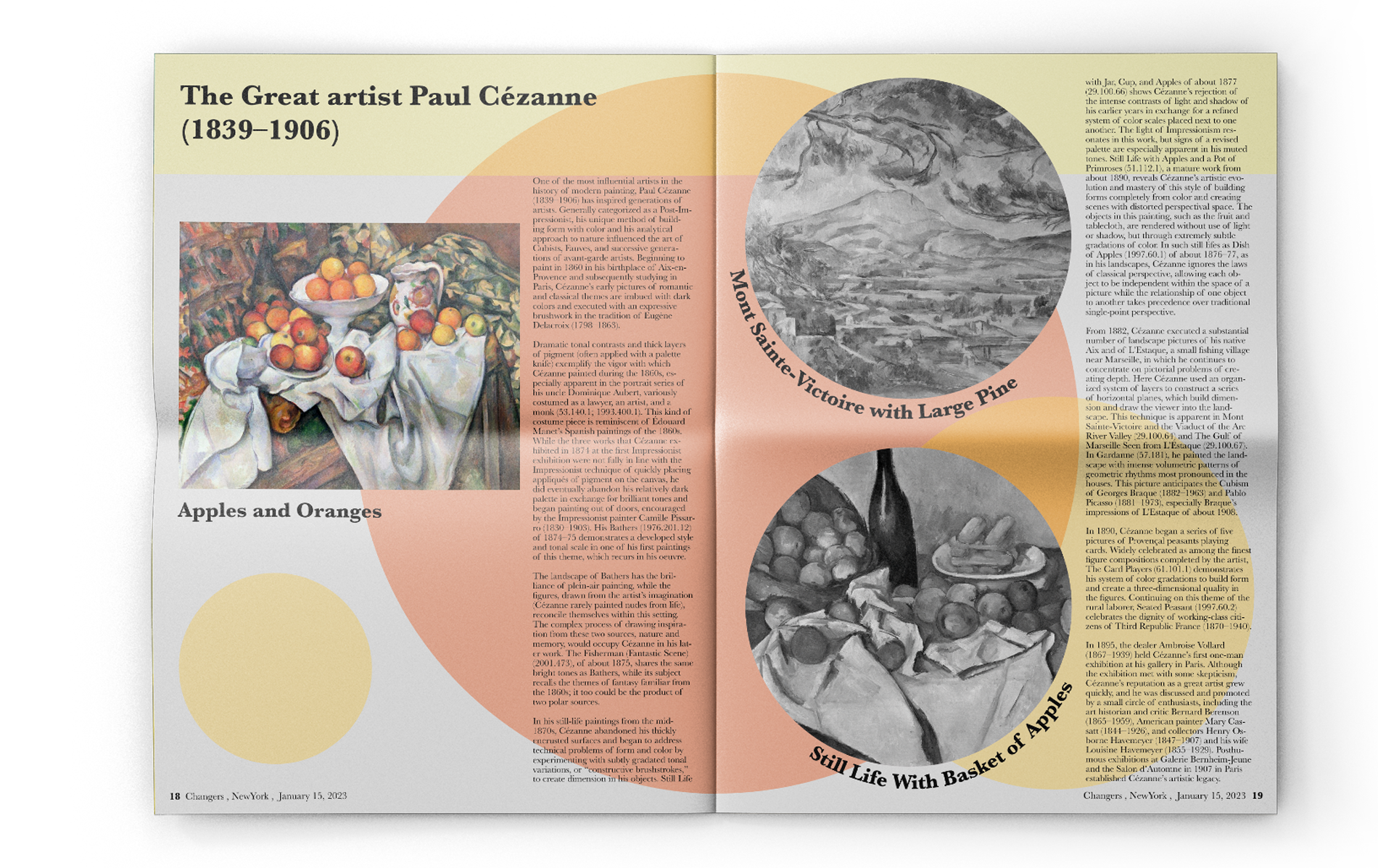
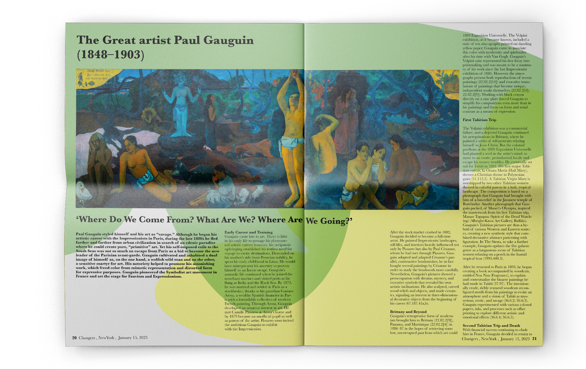
Different color systems and layouts are used to distinguish each artist’s section, while representative artworks are subtly integrated into the background to maintain readability.
A Baskerville typeface reinforces the classical tone of the era, balancing visual variety with editorial clarity.
Different color systems and layouts are used to distinguish each artist’s section, while representative artworks are subtly integrated into the background to maintain readability.
A Baskerville typeface reinforces the classical tone of the era, balancing visual variety with editorial clarity.


Other Projects