YAYOI KUSAMA
Brand IdentityInspired by Yayoi Kusama’s visual vocabulary, this type design explores the translation of her signature dots and linear rhythms into a typographic form. The letterforms emphasize repetition, connection, and contrast, reflecting the balance between order and play found in her work.
Designed as part of a conceptual exhibition system, the typeface was applied to posters, digital displays, and promotional materials. Multiple variations were developed to ensure visual consistency and adaptability across both color and monochrome environments.
Designed as part of a conceptual exhibition system, the typeface was applied to posters, digital displays, and promotional materials. Multiple variations were developed to ensure visual consistency and adaptability across both color and monochrome environments.
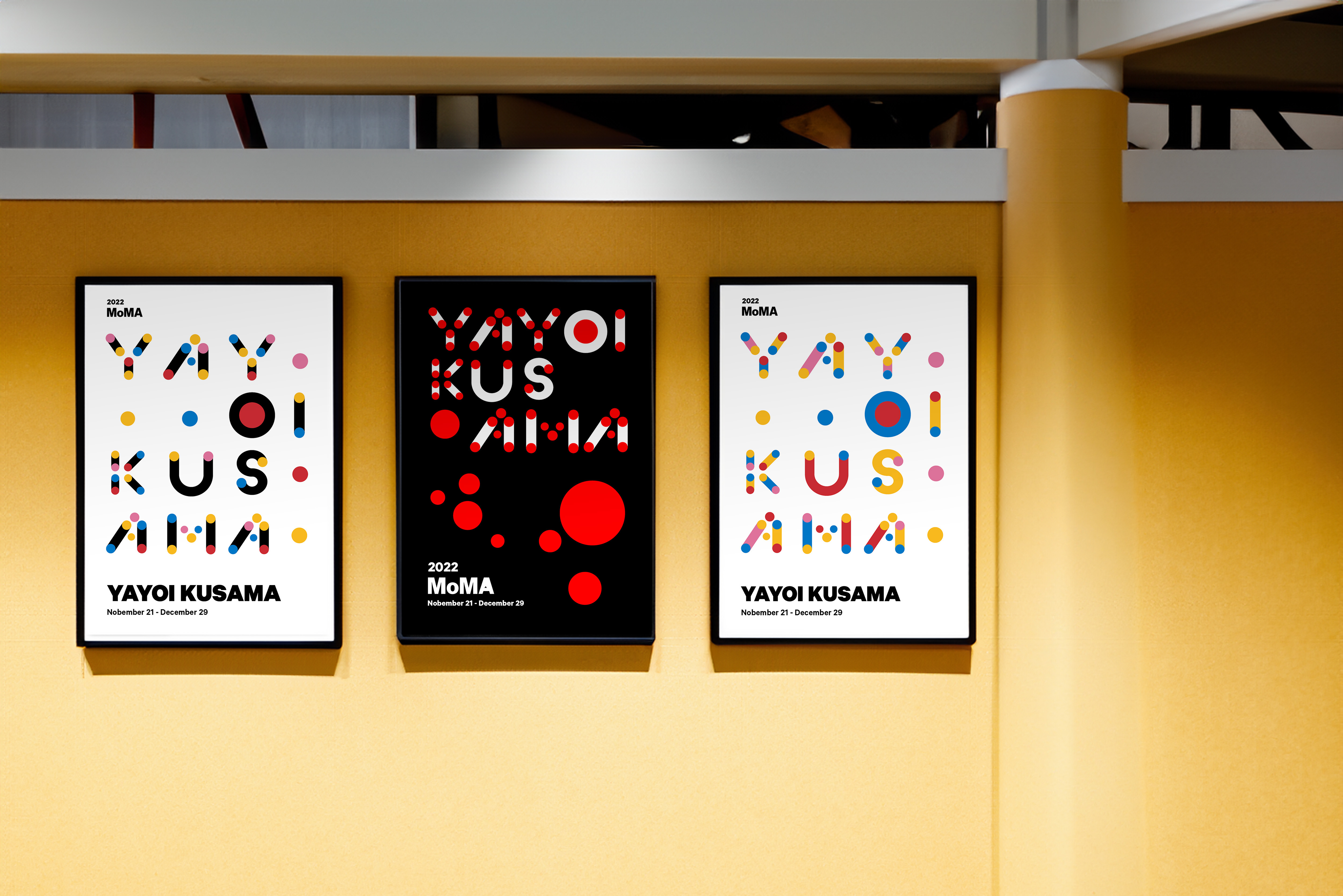

This display typeface was developed in two visual variations: one emphasizing diagonal line structures, and the other integrating circular dot elements at key intersections. Both versions were designed to explore visual recognition while maintaining a cohesive typographic system.
Inspired by Yayoi Kusama’s recurring use of dots—particularly seen in her pumpkin works—the typeface translates this motif into a controlled graphic language. To preserve clarity and avoid visual clutter, the dot system was limited to four distinct sizes, ensuring consistency across numerals and letterforms.

VERSON2

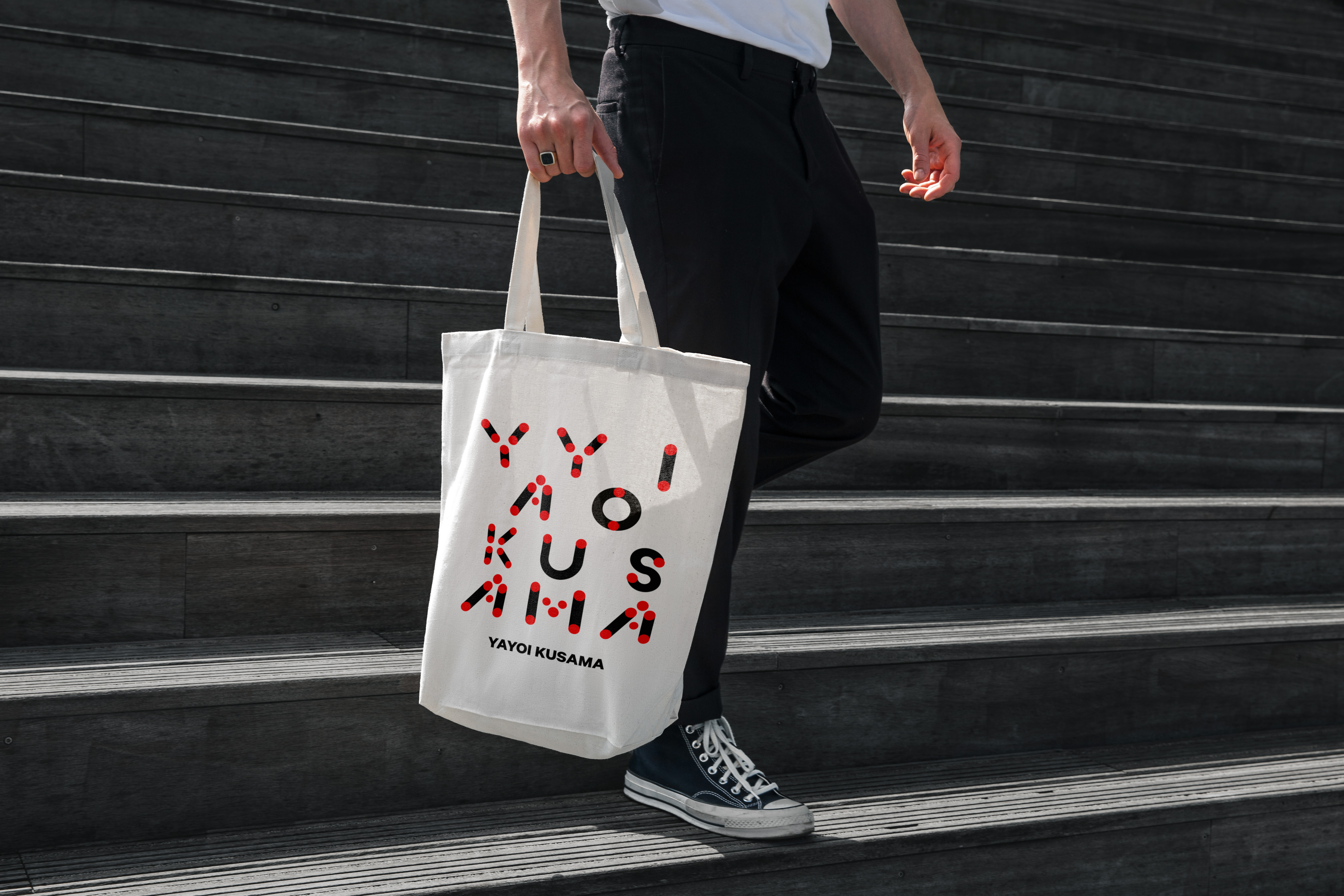
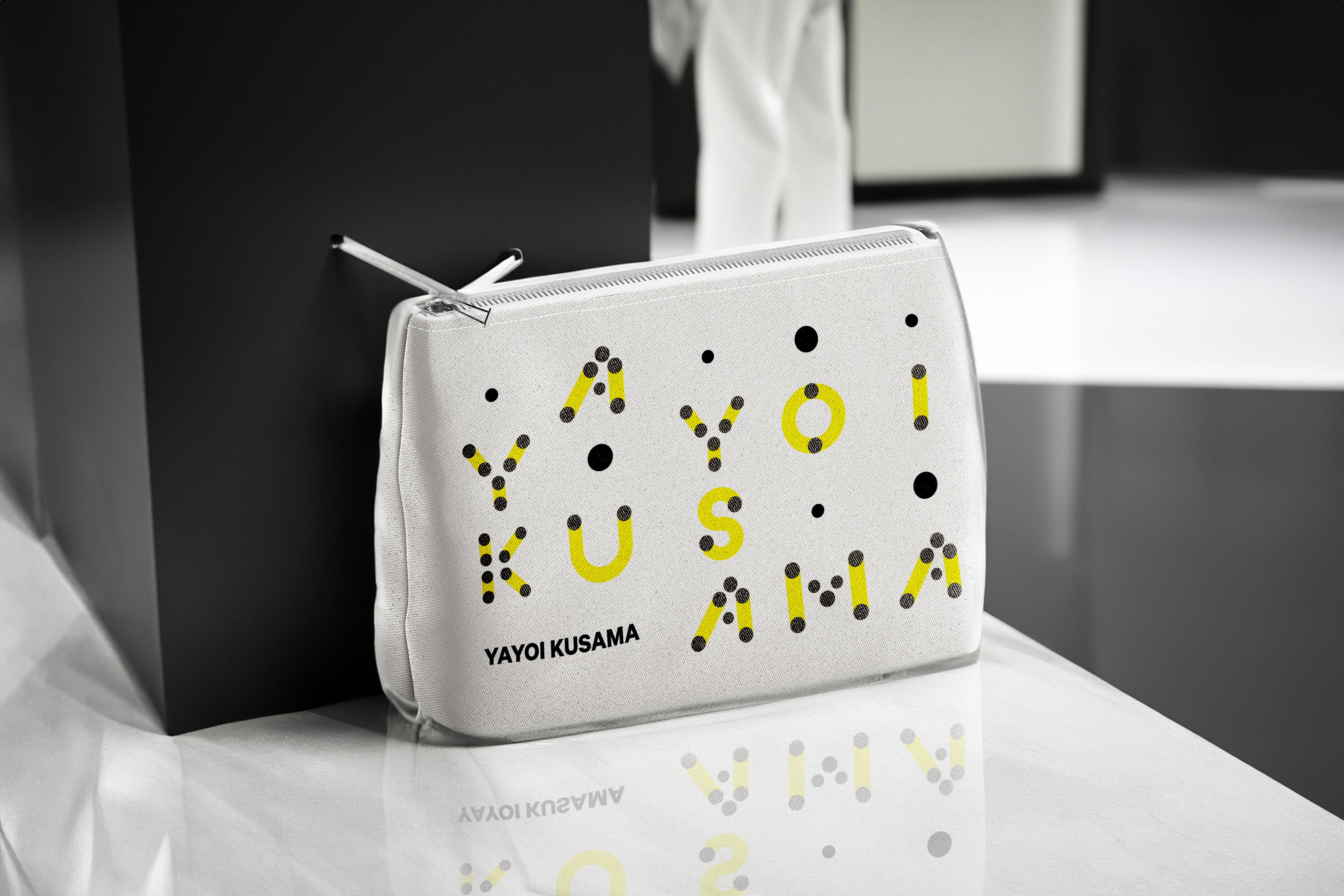

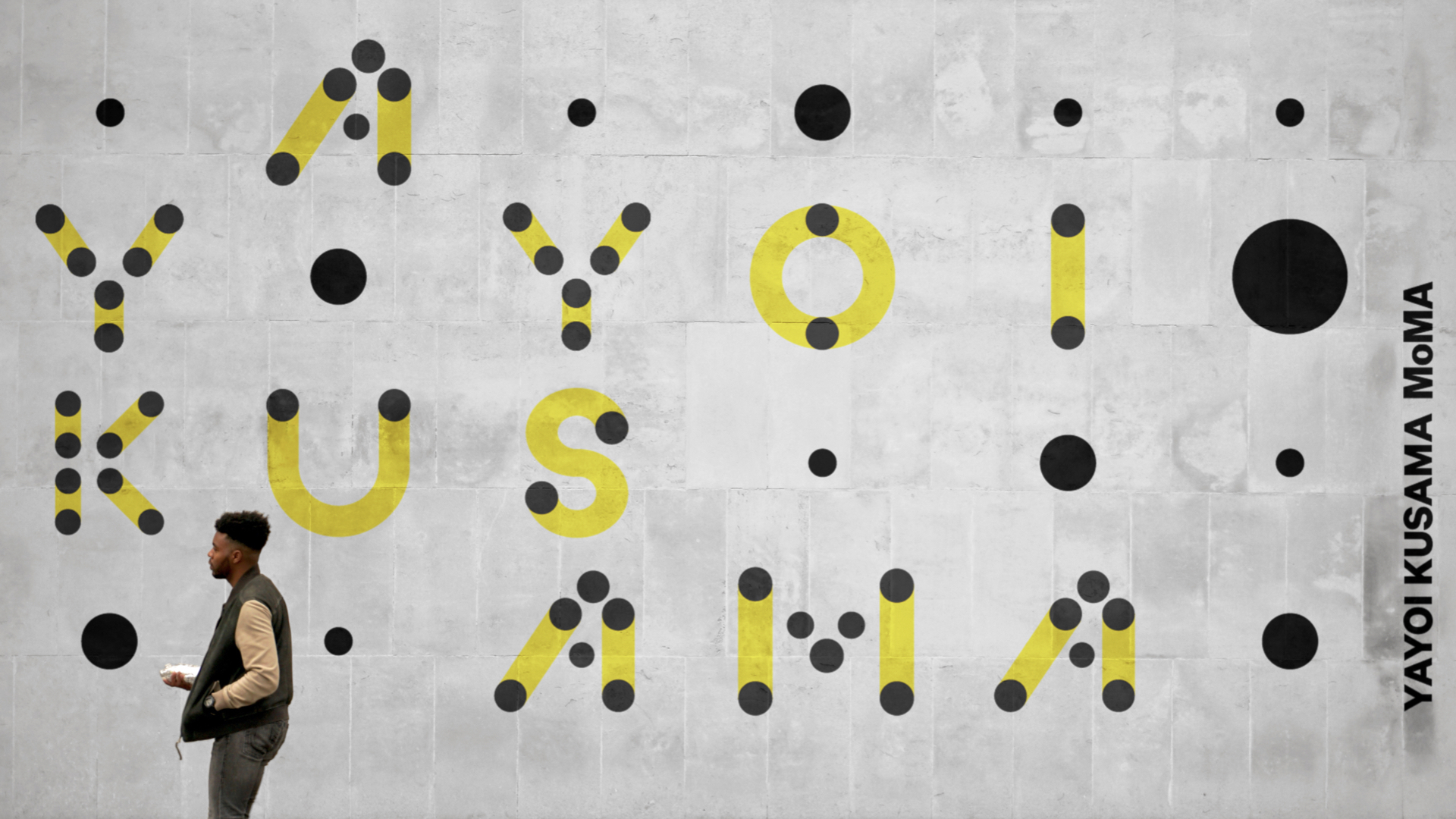

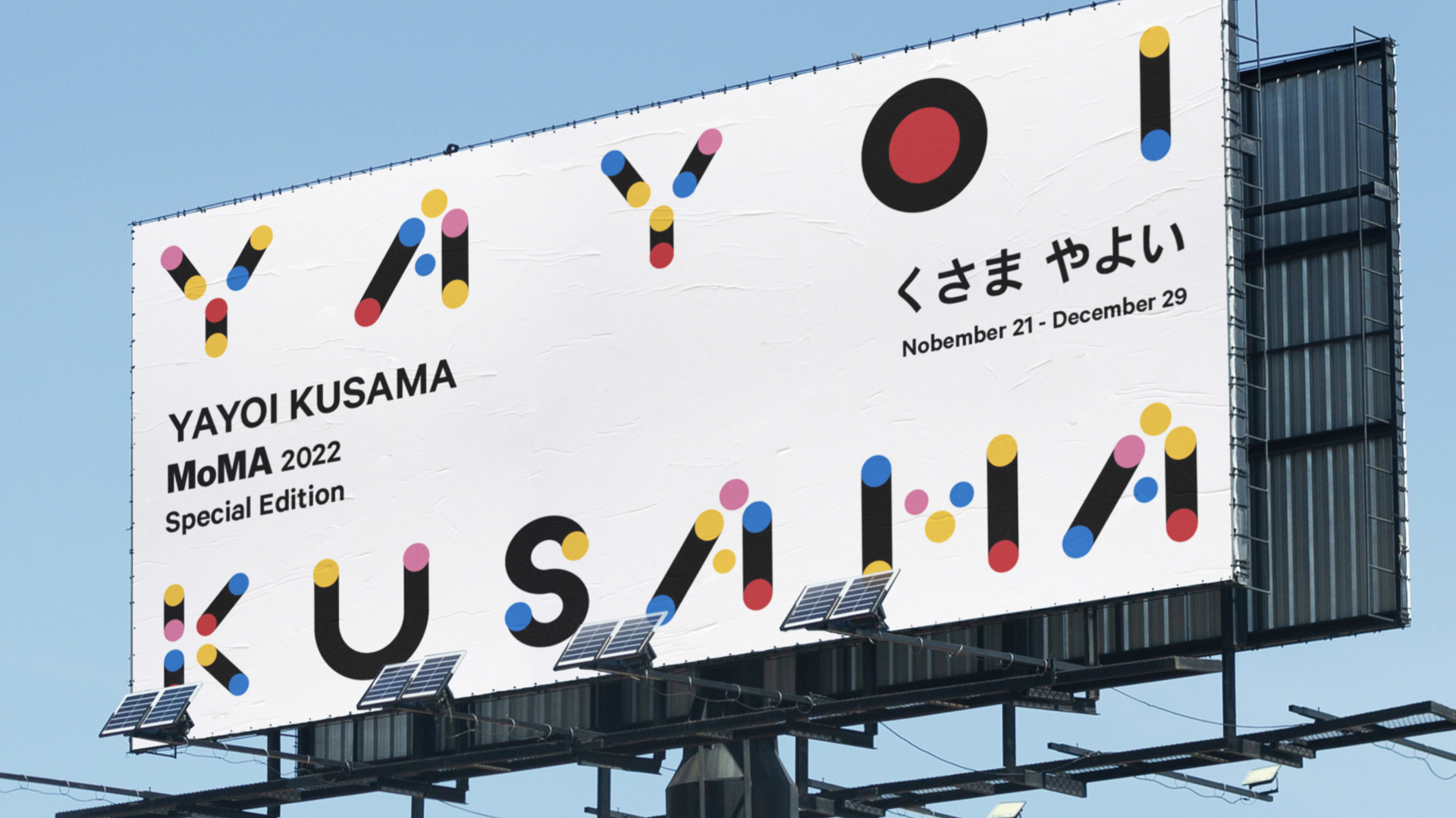
The color palette was intentionally restricted to red, blue, yellow, and black, referencing the artist’s signature use of bold primary colors. This approach allows the typeface to remain expressive while functioning effectively in display-oriented contexts such as posters, exhibition graphics, and digital applications.