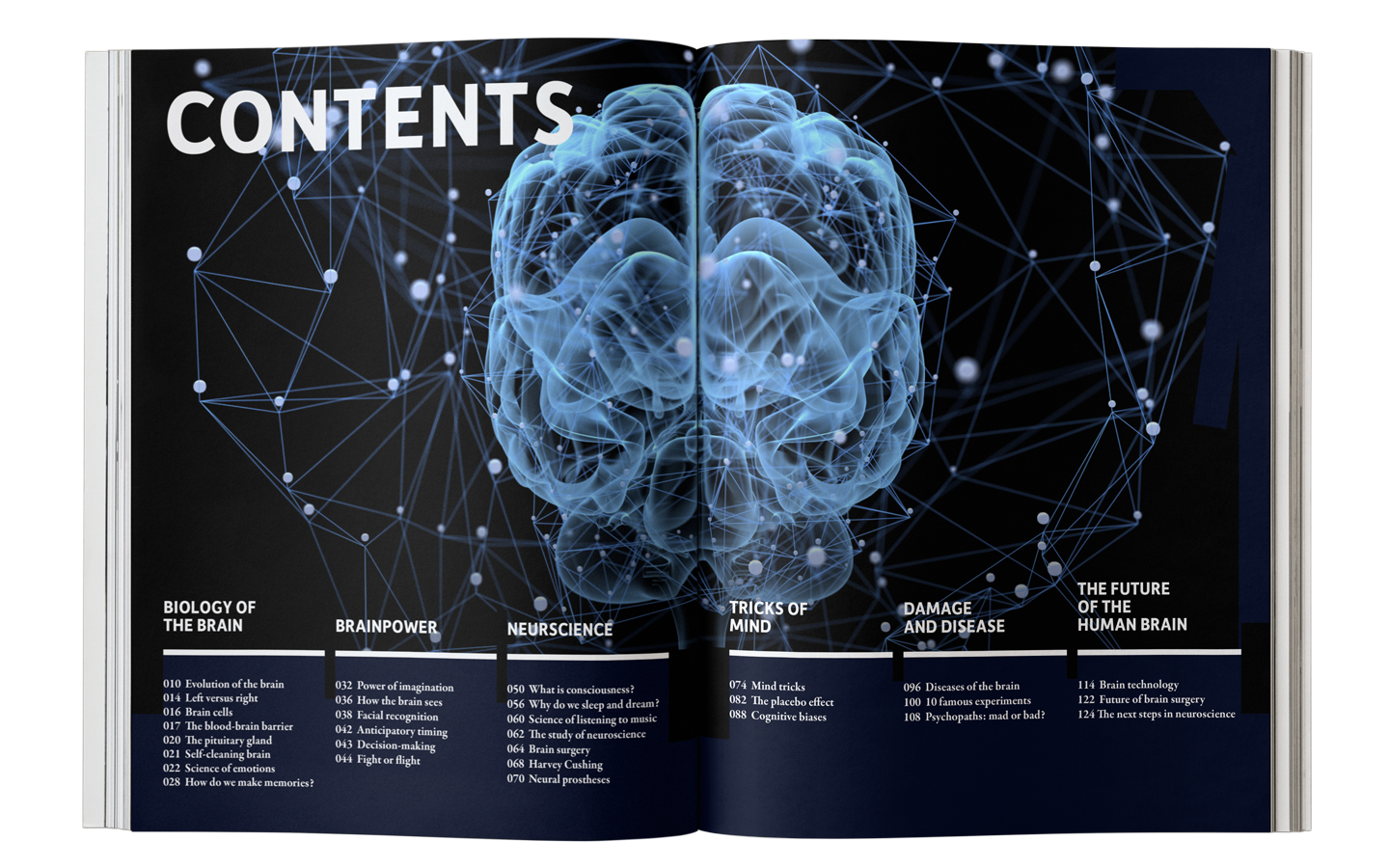
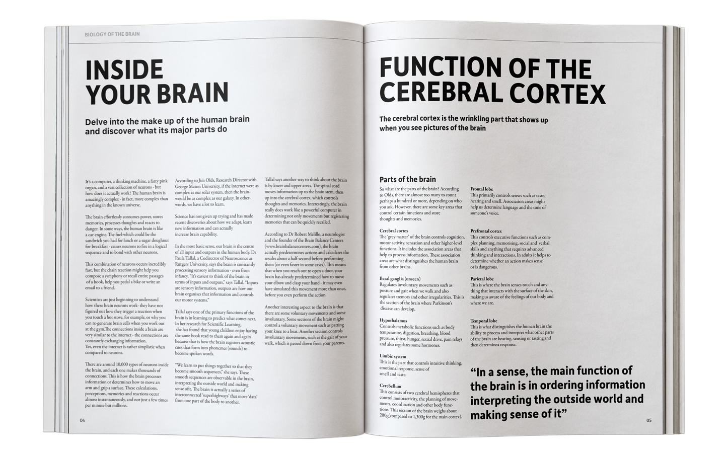
INSIDE YOUR BRAIN
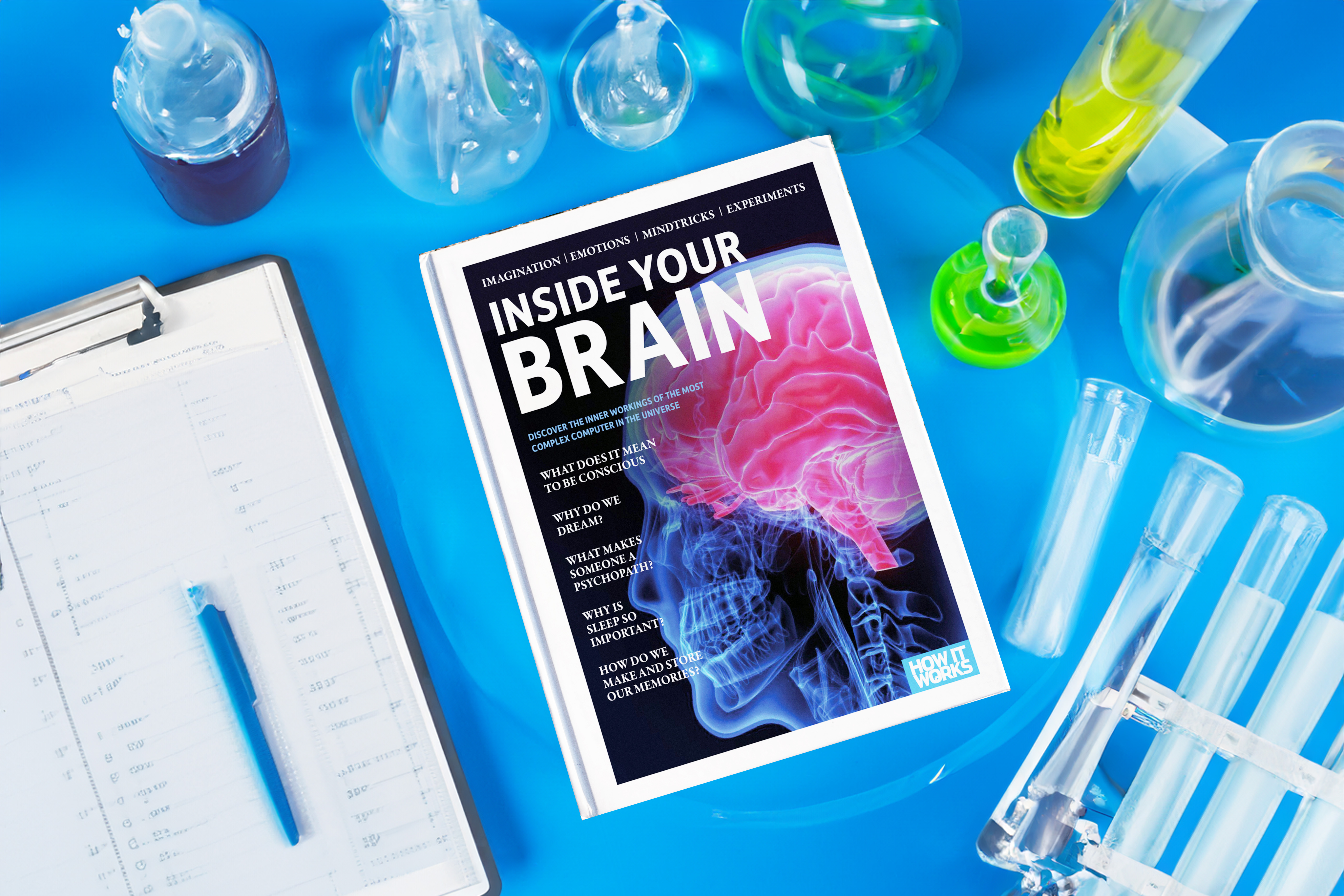
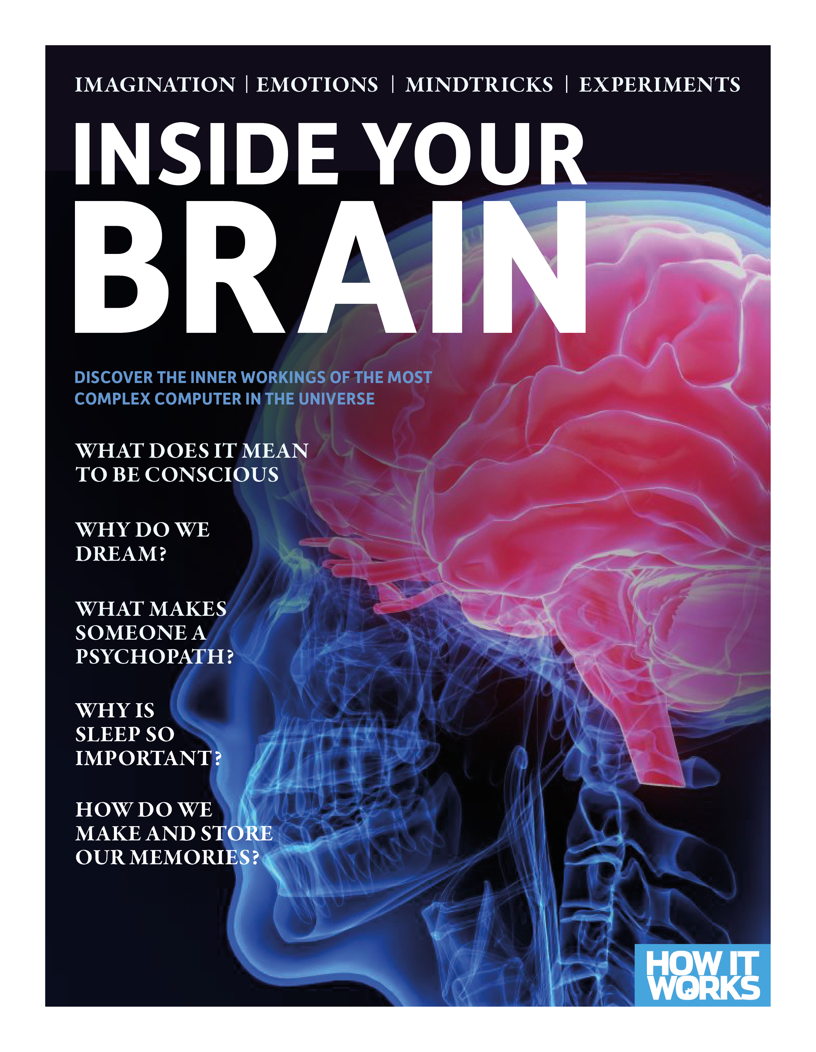
Editorial / 2022I believed that I could make a better design than this original magazine, so I redesigned it more neatly for the adults. I created 4 different covers, and the contents in it are replaced by similar images which look alike or are the same in context. Also, as it is a science magazine, I used san-serif type to give a clean feeling. You can observe different layouts and structures which I gave a try.

Origal Magazine’s Design
I changed the design as more clean and organized layout. Also change the picture more high quality however, I wanted to give a similar vibe so I used the San-serif font because I didn’t want to changed whole system and let people to recongize this brand.
What big things that I changed
1.Photo in the magzine.
2. Different columns
3.None consistent systems
4. A lot of fonts